Wahby Financial Group is an advising firm founded by a self-proclaimed “corporate dropout.” After the financial crisis of 2008, this client established a firm where her clients would know they were safe, comfortable, and taken care of. Wahby highlights the unique life-paths each of their clients take, using a kaleidoscope logo to symbolize the ever-changing beauty of the journey.
Goals
Wahby’s approachable and lighthearted manner called for a website that was similarly welcoming and whimsical. The client wanted a website that would reflect the fluidity and vibrancy of its clients’ lives, while also delivering pertinent information in a navigable way. They also needed to highlight their work with nonprofit organizations without identifying definitive ways in which they support organizations.
What We Did
- Website Development
- Core Messaging Content
Deliverables
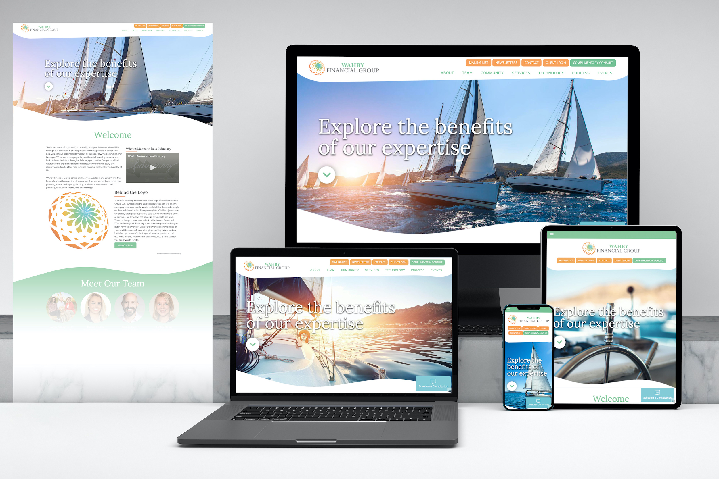
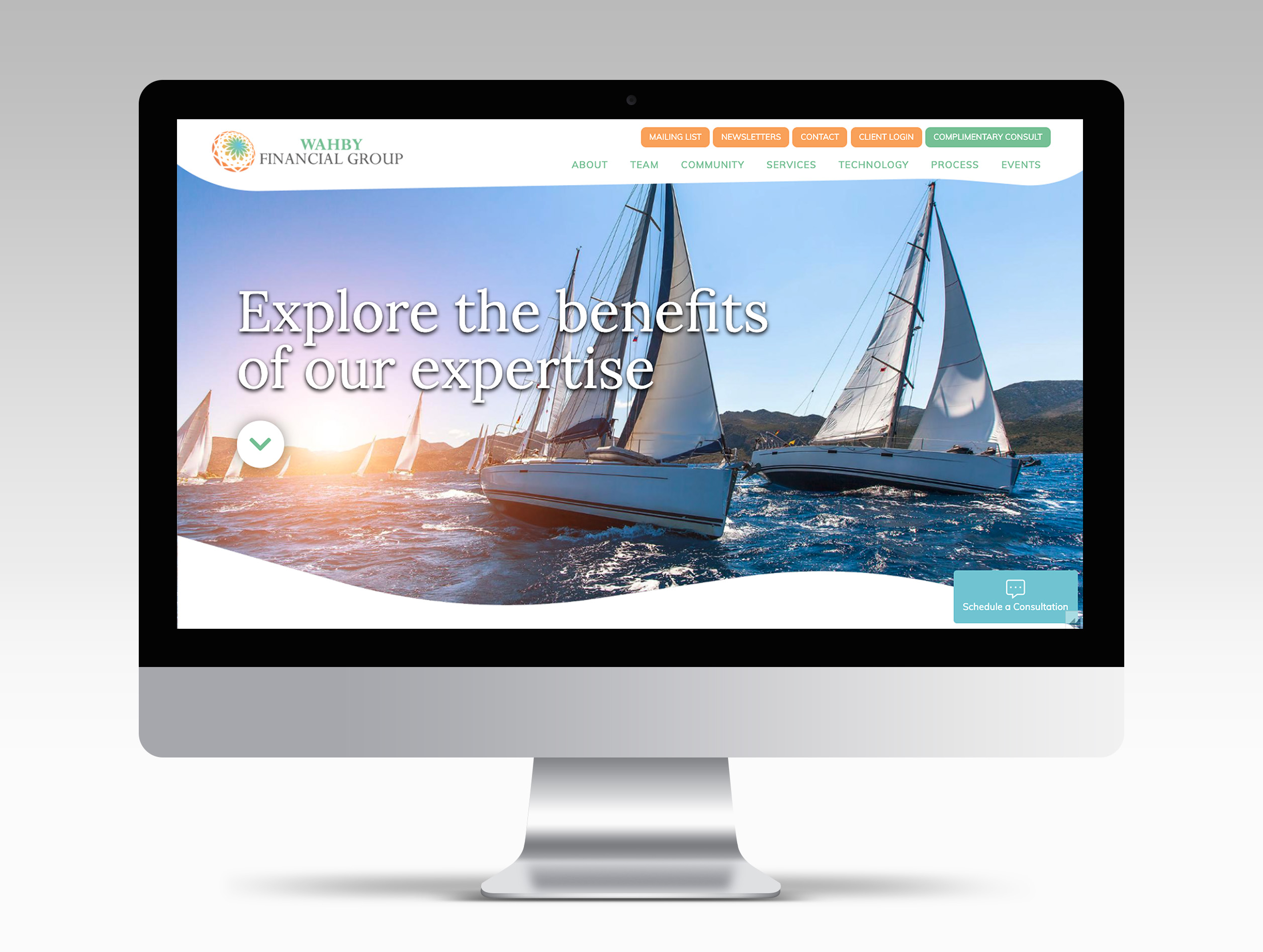
For our “corporate dropout,” client, we wanted to design a brand that was similarly rebellious in its brand expectations. Where many financial websites feature basic blues and grays, our team chose a vibrant array of orange, green, and blue to characterize Wahby Financial Strategies. This artistic palette provides a more cohesive visual that complements the personality of the firm in a way that more standard, neutral tones could not. Read more...
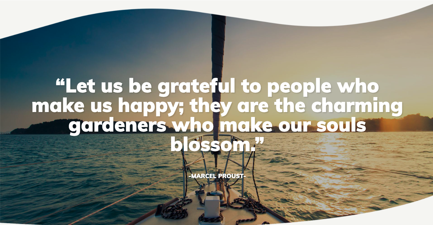
We opted for an infinite scroll-style site where each section of content lives on one page, with a sticky navigation at the top that allows users to click from section to section. This flowing style with its curved section breaks reflect the easy-going nature and fluid theme of the brand while allowing the firm to feature relevant quotes as section breaks between the main content elements.
To highlight the firm’s community involvement, we added a section in the scroll that highlights some of the organizations Wahby supports.
