Scheideman Financial Strategies is a money management and financial planning firm in a small town in Iowa. They serve a wide variety of people, from small business owners to farmers and veterinarians. Scheideman’s goal is to helps its clients create financial roadmaps that get them “from point A to point B.”
Goals
This financial firm believes that finances don’t have to be stale and boring—and neither do we. Our client wanted a bright, optimistic site that made users feel comfortable while they researched financial services. They loved the idea of adding animation to the site, and they wanted to include photos their clients could relate to. Scheideman also wanted to better showcase their planning services, as well as their services for farmers and ranchers.
What We Did
- Website Development
- Logo Design
- Core Messaging Content
Deliverables
We decided to tie in Scheideman’s “from point A to point B” framework with a connect-the-dots style of animation that guides users on a journey through the highlights of the website. This element not only makes the site playful and interactive, but directly points users to the most important sections of the site—who Scheideman is, what they do, and how to get in touch. For many of our clients, this is the primary information we designate to the homepage. This way, a user has all the necessary information to take the next step to do business without having to click to an additional page. For Scheideman specifically, we used icons to highlight their areas of expertise, intentionally adding “Financial Planning” and “Farm/Ranch Protection” as specialty services. Read more...
Rather than basic photos, we used the Ken Burns effect on the homepage photos to complement the animated and dynamic feel of the rest of the site. We chose photos that featured a wide range of people and industries to provide points of familiarity for each of Scheideman’s target markets.
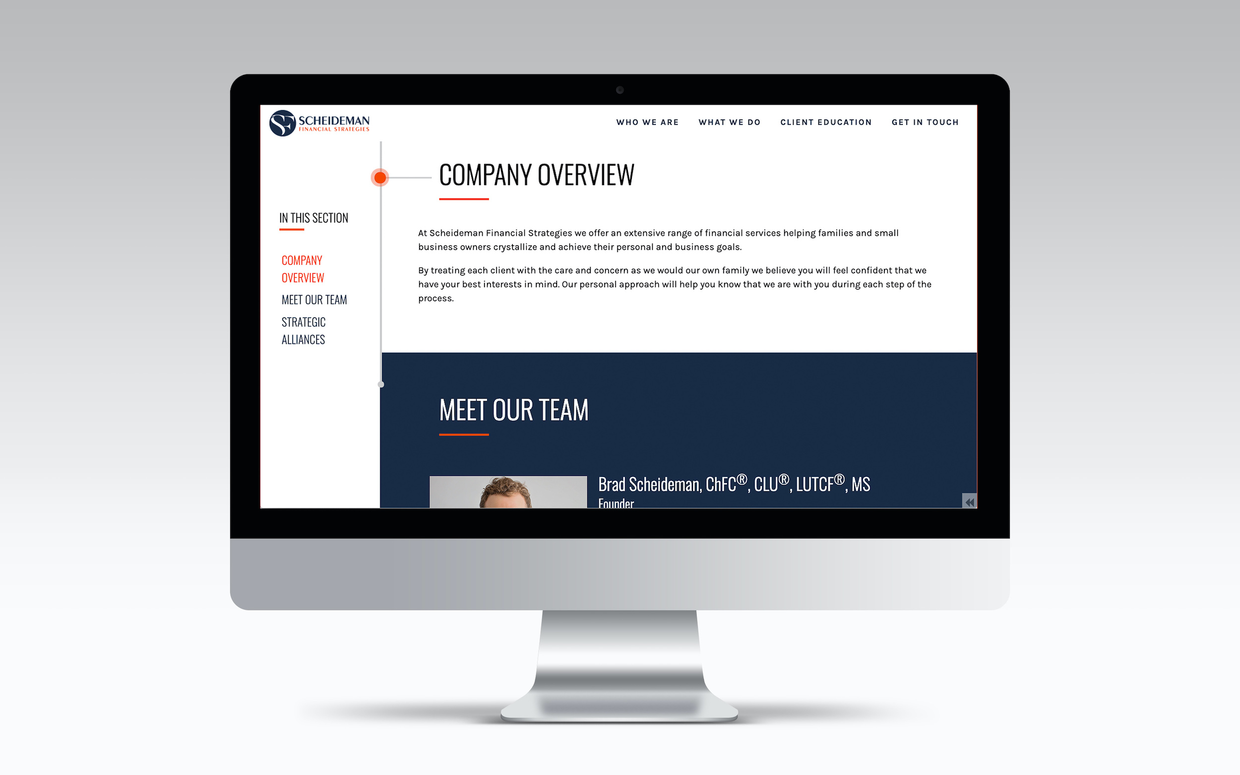
Sheideman’s interior pages also feature a unique side-navigation that allow the firm to share additional content in an organized yet edgy and playful way. The dot that leads users through the site pulses and moves as users click through each page, which almost gives the impression that Scheideman is presenting the information anew each time a page is clicked.


