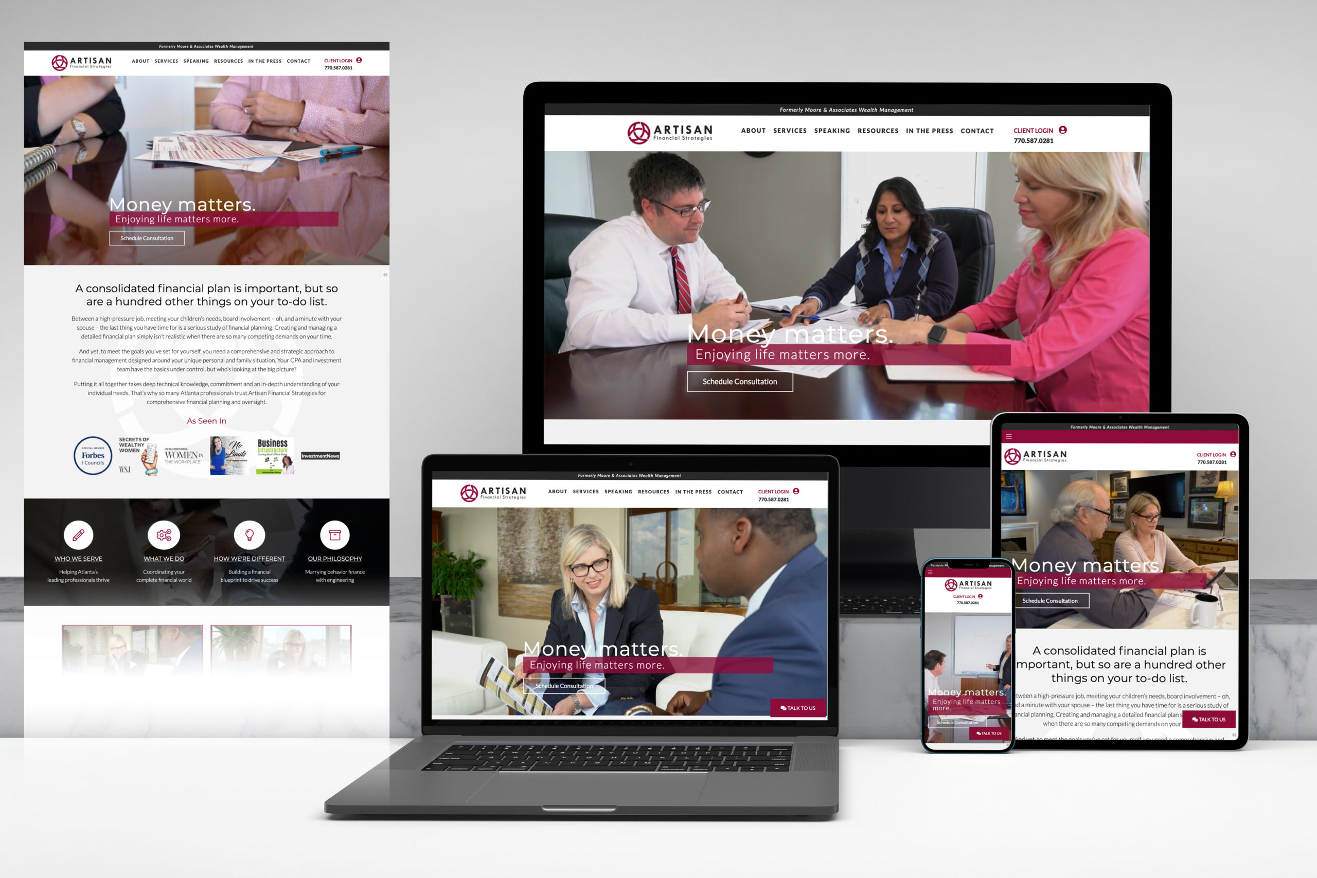
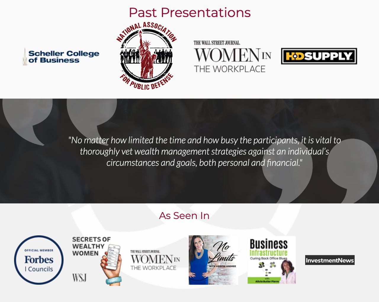
Artisan Financial Strategies offers its clients a unique approach to planning by blending behavioral finance with engineering. This firm leverages education as the cornerstone of their planning approach, and they position themselves as industry influencers in the way they approach clients’ financial decision-making. The brand promotes financial empowerment, particularly for women and their growing earning power, and much of their marketing points users back to their educational content, including appearances in the press, mentorship roles, research, articles, podcasts, and speaking events.
Goals
At the time of this website development, Artisan’s advisors had been serving clients for 20 years, and during a season of substantial growth, the firm needed a rebranding and new website that would allow them to better serve more clients at a higher level. With a passion for financial empowerment and education, the firm wanted a site that would speak to women entrepreneurs without alienating other prospects. They also needed their website to offer distinct ways for people to get in touch and drive users to take action on each page. Read more...
Artisan’s unique approach required a website that was feminine yet sturdy, a design that would highlight the founder’s passion for serving women entrepreneurs and the firm’s innovative and methodical approach to planning.
What We Did
- Website Development
Deliverables
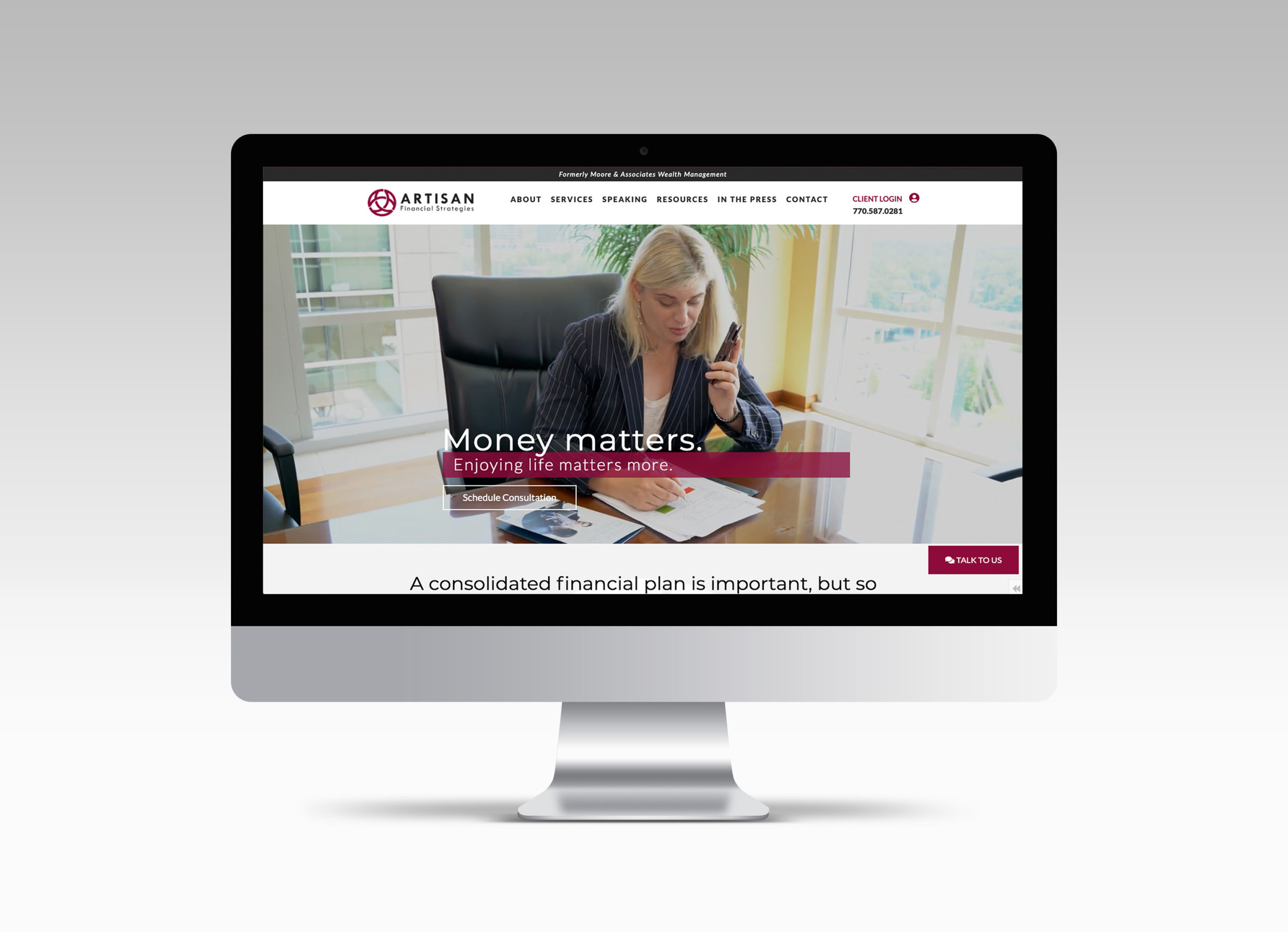
This firm brings a wide level of personality and expertise to its clients, and we wanted the website to allow prospects to see just who Artisan is, so videos and photos of the team working with clients are the focal point of many of the website pages. Read more...
Throughout the site, we leveraged a unique fuchsia tone that provides a feminine and bold pop of color on the otherwise black and white website.
Because of their highly educational approach and extensive media presence, Artisan has a large quantity of content they need to make available to prospects and clients. To include all of the firm’s valuable resources without overwhelming users, we used a sticky top-navigation with drop-down subpages, which makes it easy for users to navigate from section to section. For websites with substantial content, we make it a point to organize each segment in a way that would make sense to any new user.
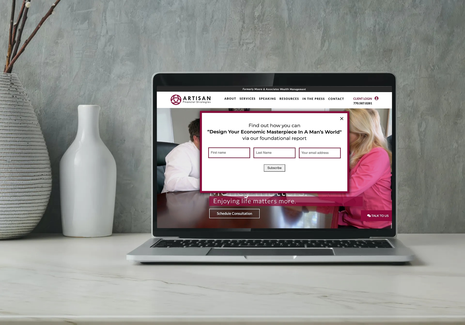
Most advisors need what we call a brochure-style website—one that primarily provides a place for prospects to learn more about the firm and determine if that advisor is the right fit. But because of Artisan’s focus on education and their desire to reach a wider audience, they needed a website that also aided their active marketing campaigns and pushed clients to convert. For this reason, we added call-to-action buttons and fields on every section of the website. The site features a sticky “Talk to Us” button in the bottom corner that prompts users to schedule a meeting through Calendly; the homepage also features a button to schedule a consultation (above the fold), a form to sign up for their newsletter (below their core content), and a pop-up that offers a free educational download. Many of the sub-content sections also contain calls-to-action related to the content, whether that’s prompting users to request a speaking engagement or download an educational resource.


