Modern Best Practices for Advisor Websites
These days, a website is one of the most crucial elements an advisor can have in their digital presence arsenal. A website is where you can share your story, where you can host relevant and interesting articles and news, how you can make it easy for your clients to access their accounts, and to ensure there’s a way for people to get in touch. Without a website and some kind of online presence, you might as well be out of business.
Modern consumer behavior dictates that when someone is referred to you, the first thing they’re going to do is NOT to pick up the phone and call you – they’re going to start by vetting you. We like to call this “the test you don’t know your taking,” because more often than not, when your digital presence isn’t great, you don’t pass the test, and you never even knew that someone was looking. In the past, we’ve had advisors tell us, “I don’t need a good website because all of my business is referral based”. But looking at the analytics of their site, we were able to prove to them that their belief simply wasn’t true. They were then appalled that their presence was so bad, and quickly did everything they could to remedy it – which subsequently led to more business from referrals.
A modern best practice website should contain information around three things:
- Who You Are
- What You Do
- How to Contact You
If you have anything else on your website, it should all be designed to supplement those three categories. If you have nothing else on your website, you must have those three things.
Other Best Practice Criteria Your Website Should Meet:
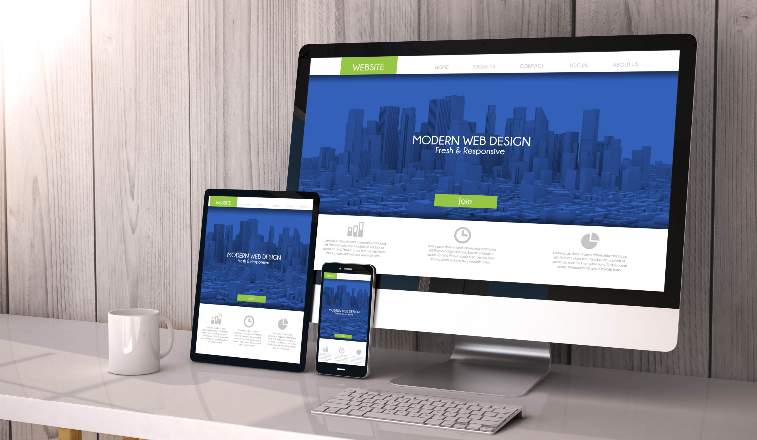
It should be easy to use and navigate regardless of the type of device someone is looking at it from.
A mobile responsive website is crucial, as over 75% of traffic comes from mobile phones and tablets these days. To add to that, Google won’t even show your website in search results anymore if it’s NOT mobile responsive.
Your website should match the look and feel of your brand as a whole.
If someone were to look at everything coming out of your company, it should all have the same look and feel – meaning you use the same colors, the same font, the same picture style, the same types/tone of verbiage, etc.
The items on your website should inspire a prospect to take action.
Having something on your website just to have it there isn’t doing you any good. Instead, choose wisely, and don’t be afraid to brag about your company a little bit. Sometimes, the difference maker between winning and losing a sale could just be that the other guy bragged a bit more. Even if the client has no idea what that award from that random organization is for, it’s impressive that you won it and helps to eliminate doubt in their minds.
Pictures and imagery are critical.
Having a website that lacks color and vibrancy can be an instant turn off for some folks. We always recommend having pictures somewhere to add some visual interest and to break up the words on a site. Pictures can make or break a site, though, so choose carefully. There are three types of pictures to choose from: personal/team photography of you and your staff, landscape photography, or people pictures. The first two are pretty self-explanatory, but the third has a hidden trap. The stock photos of people that you find, where they’re looking at the camera and smiling, may look like your ideal client. But, when a photo like that is so blatantly obvious that it’s a stock photo, it instantly (subconsciously) turns people off – especially those in a more affluent market. Instead, look for stock photos that look more candid and ‘in the moment,’ or those that are silhouetted against a bright background to imply the type of people you want to do business with.
Don’t be afraid of duplication.
Crucial elements, like your phone number, should be easy to find and in a couple different places. For example, having a phone number in the footer of your site (which displays the same across every page), as well as on a contact page, would be what we would recommend at a minimum. If you want to add that number to the header and on your team page too, great! Different people navigate websites differently, so don’t be afraid to duplicate key elements that are important and that you want to make sure people see.
If you need help employing any of these strategies to your website, please don’t hesitate to reach out!