
5 Pro-Tips for Choosing Fonts
“Learn the rules like a pro, so you can break them like an artist.” – Pablo Picasso
When it comes to designing something – whether that’s a website, a brochure, or even a powerpoint deck – there are few hard and fast rules, and they mainly revolve around user experience. That said, choosing the right fonts for the project is a purely creative and subjective process, though it can make or break the end result. Oftentimes, when we are working on a new project, most of our choices for fonts and colors are based on the client’s brand, however there are still some reasonings behind our choices. These tips will let you in on a little “behind-the-scenes” designer insight, and may help you make better decisions when choosing fonts for your next project.
Before you start reading through these tips, there’s a few things you should keep in mind:
- Remember that design choices are subjective, so what you like may not be what we like, or what your audience likes, and generally, that’s okay! However…
- When designing something client-facing, design for the tastes of the client, not your tastes.
- Rules are sometimes made to be broken, so as long as the user experience is still great, feel free to stretch boundaries.
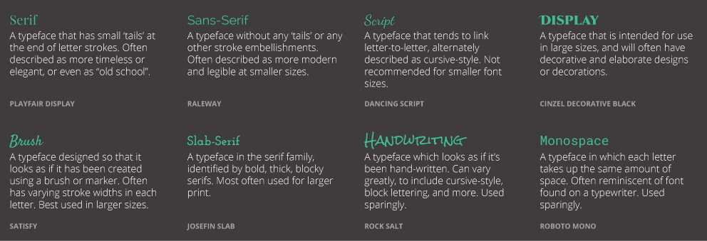
Finally, take a look at this graphic that is designed to help you understand the different types of fonts available.
1) Contrast is important
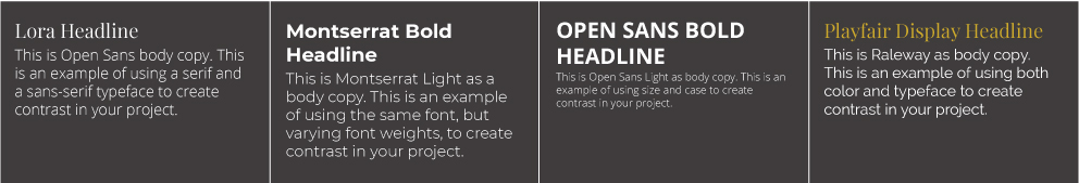
There are lots of ways to provide contrast. You can do it using two types of fonts (serif vs. sans-serif), varying font weights (light vs. bold), varying font sizes and cases, or even through the use of color. Regardless of how you do it, contrast provides powerful visual hierarchy and helps guide your user through your project.
2) Fit your font to your context
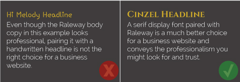
Fonts have moods and they convey a feeling through your final project. Choosing the wrong font to fit the feeling you’re trying to get across can complete derail the piece and create a disconnect in your user experience. For example, if you’re going for a timeless elegance, a serif font typically conveys that; whereas modern flair can often be found by using a brush font.
3) Make a decision, and go with it
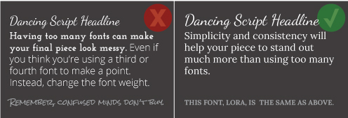
When choosing fonts for your project, choose two, or in a unique situation, and as a max, three. Any more than that and your piece will feel messy, amateurish and will create a poor user experience.
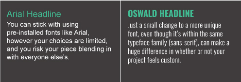
4) Don’t be afraid to go out of the box
Every computer comes with a pre-installed set of fonts, such as Calibri, Arial, Times New Roman, Papyrus and Comic Sans. However, designers are coming up with new and unique fonts every day, and there are a ton of websites to get them from. Stepping outside of the pre-installed fonts to choose something that truly fits your project will not only set you apart, it will also show that you took time to craft your project.
(And please, never use Comic Sans or Papyrus. Just don’t.)
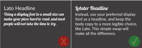
5) Legibility is important
Just like you want to consider the context and mood of your piece, it’s also important to ensure that your text is legible – otherwise you are wasting your time creating your project. If you use a curly, loopy script font for the small body copy on your website, chances are that a majority of your users are not going to be able to read it. Same goes for the small text on your business card – it has to be easy to read or no one will ever contact you from it. The easiest way to test how legible your font is, is to look at it in its actual size, and to assess it with a glance – if you can’t read it, then the font isn’t right.
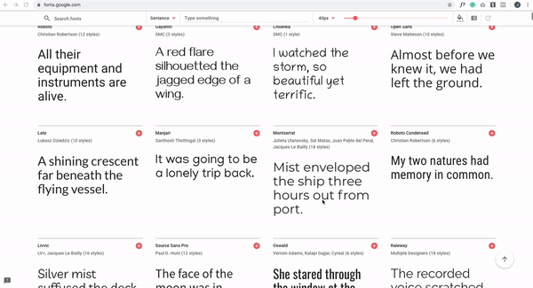
6) Bonus! Google Fonts can make pairing fonts EASY
Especially for your website, but for other pieces as well, Google Fonts makes it super easy to choose fonts that look great together. Just go to fonts.google.com, find a font you like, and when you hover over it and click “see specimen” in the bottom right, it will show you popular font pairings to inspire you. Even better, you can type your own text into the font sample so you can see what it would look like before ever using that font in your project.
When all else fails and you need help taking your project to the next level, please don’t hesitate to reach out. We’re here to help with all of your branding, marketing, and advertising needs, and we look forward to working with you to bring your ideas to life!
*As a note, every font used in this post is a web-friendly Google font and can be found on fonts.google.com.